 Wagtail + CodeRed Extensions
Tutorial Part 3: Adding Content, Custom CSS
Now let’s start adding some content to our site.
Adding a hero unit to the home page
In the admin dashboard, select Pages >. This will open a tree-style view of all the pages on our site. You will see all the pages we added. Click the pencil icon to edit the home page, or click “Home” and then the “Edit” button.
Here in the body section is where we can add our content. Each component in this section is called a “block” and provides a different format of content. Wagtail CRX is heavily based on Bootstrap CSS and its grid system, which means all content is based in rows and columns that dynamically stack depending on the visitor’s screen size. Read more here.
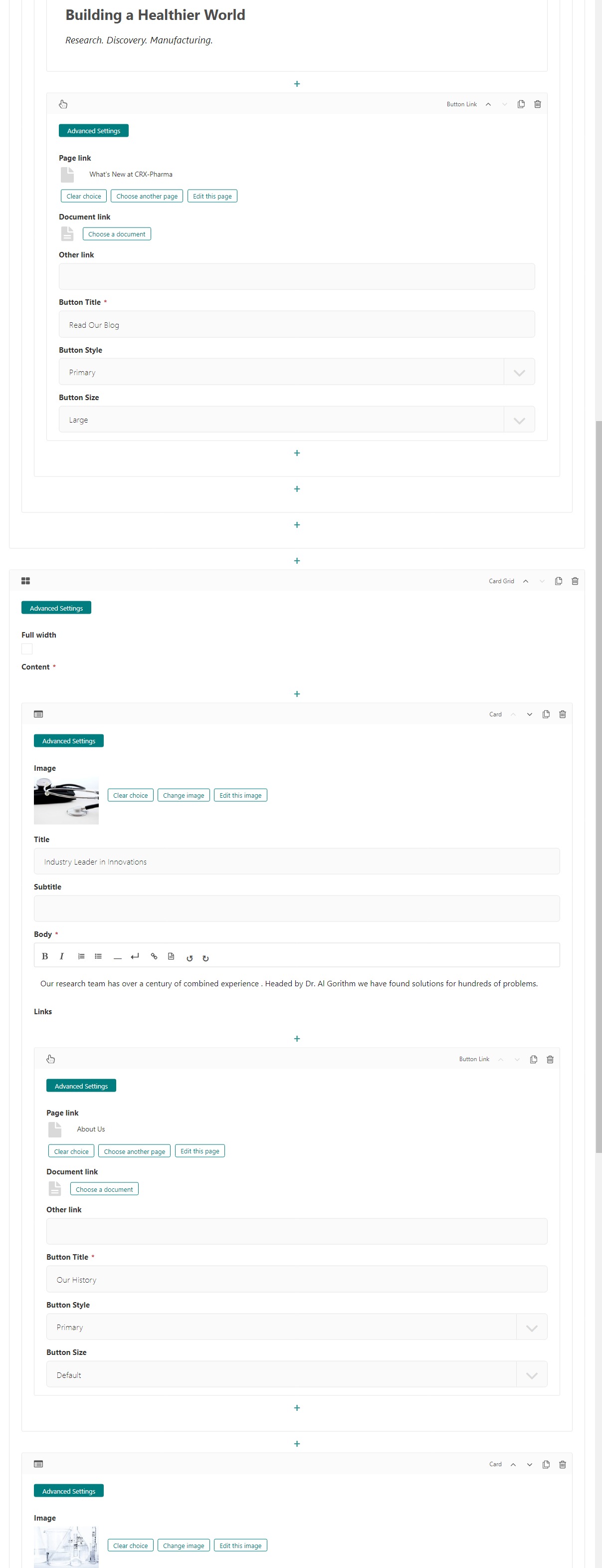
First, let’s make a big flashy hero unit. A hero unit in Wagtail CRX is a block that allows for a full-width background image or background color, and has lots of padding by default.
Select the Hero Unit block.
Be sure full-width is selected. (It should be selected by default when using a Hero Unit block)
Next set a background image - we are going to download and use this laboratory image from Pixabay.
Enter “white” in the Text color field
Let’s add content to our hero unit. Under the Content field:
Select Responsive Grid Row
Select Column. Inside our column,
Add Text block
Enter “Building a Healthier World” as an H2 in bold.
Enter “Research. Discovery. Manufacturing.” as an H4 in italics in the same text editor.
Next, click the small “+” icon directly below the text field. This will let you add another block directly below the text, but still in the same column.
Select the Button Link block. There are a few options here.
Choose Page Link and link it to “What’s Happening at CRX-Pharma” page.
Change the Button Title field to “Read Our Blog”
Change the Button Size to large.
My editing page now looks like this:
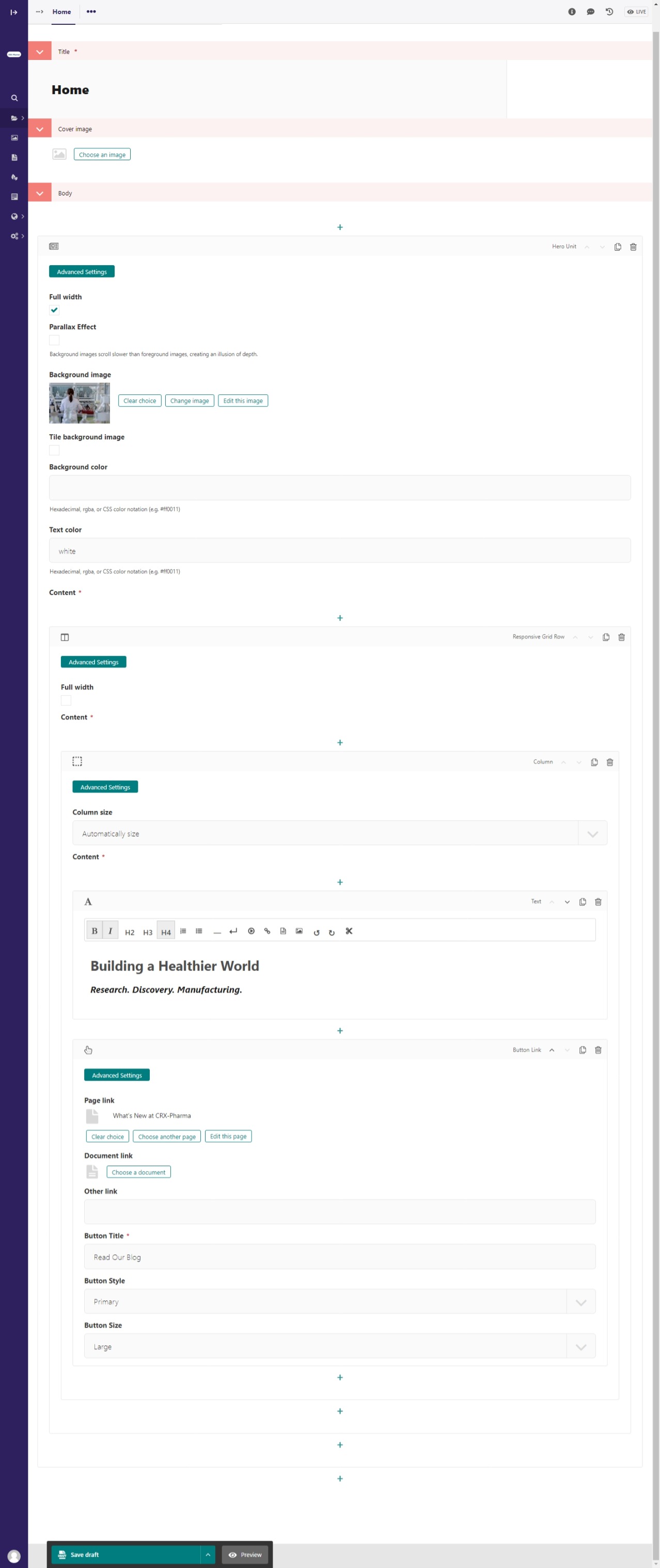
The home page editor after adding a hero unit.
Next click Save draft and then Preview button at the bottom, which will open up a preview of the home page in a new tab. Great success!

The home page preview after adding a hero unit.
Custom CSS
You may have noticed a few issues with our page. The white text in our hero is a little hard to read and the search input is light teal. Let’s add text-shadow to the hero text with our own custom CSS class. This will make the text stand out from the backdrop. We will also change how we are giving the body a background-color.
In your file explorer go to mysite>website>static>website>src>custom.scss
Add the following code under // Add your custom styles here. (line 26) :
.text-shadow {
    text-shadow: $dark 1px 1px 12px;
}
We will also add this :
body {
    background-color: #a4f1e9;
}
Using the HTML body tag is another way to alter the background color of the site.
Our custom.scss file after adding the above code:
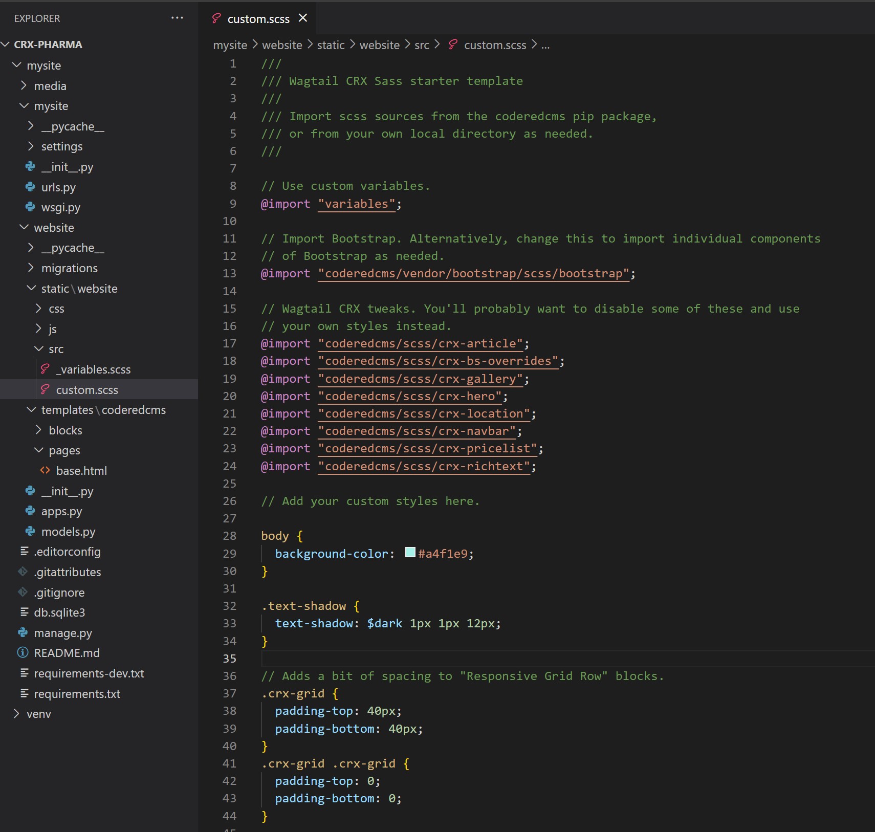
custom.scss after adding custom classes. Be sure to save this file!
Next we will remove or comment out the global body color $bg-body (line 36) in the mysite>website>static>website>src>_variables.scss file because it’s changing the background-color of the inputs. Our newly added css will now change the background-color of the body.
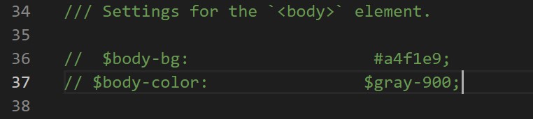
$bg-body commented out in mysite>website>static>website>src>_variables.scss. Be sure to save this file!
Compile the sass. In your terminal:
Stop your server with ctrl + c.
Run:
$ python manage.py sass website/static/website/src/custom.scss website/static/website/css/custom.css
Restart server with python manage.py runserver
Hard refresh your web browser
Lets use the text-shadow class we just made.
Back to the home page editor screen, in the column block, click Advanced Settings
Enter “text-shadow” in the Custom CSS Class field. See below :
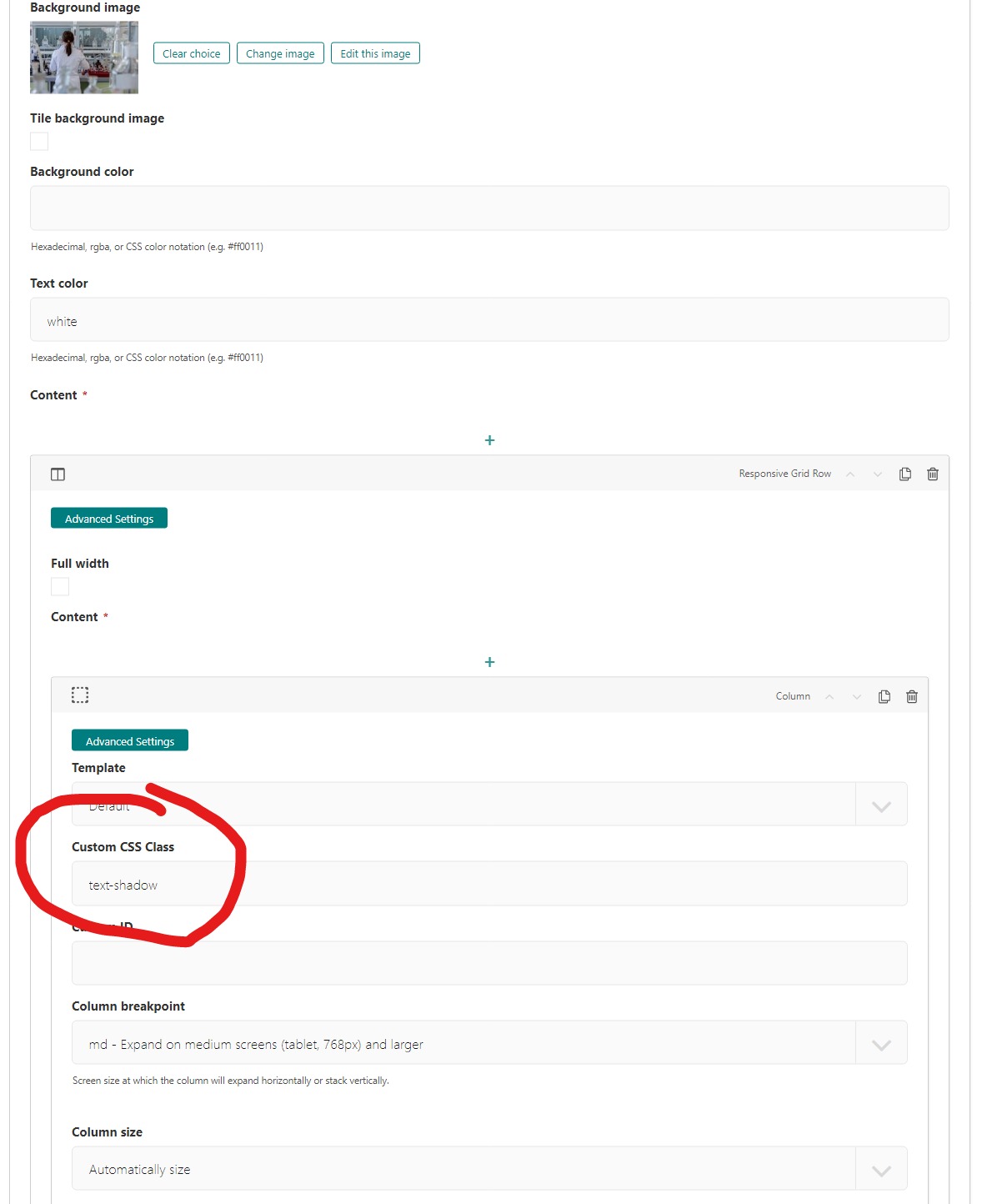
Adding a custom class
Save and Publish

The hero unit with text shadow and the search input background no longer is light teal.
Awesome. The inputs are no longer have the light teal background and our text in the Hero Unit has a shadow that makes it stand out from the backdrop.
Adding cards to the home page
Note
We used these images from pixabay in our cards. You’ll need to download them.
Let’s add three cards to highlight CRX-pharma’s strengths. Go back to the tab with the home page editor. All the way at the bottom of the page, click the “+” icon directly below the “Hero Unit” block. This will add a new block directly below the hero unit.
Select the Card Grid block.
Select Card to add the first card.
Add an image (stethoscope)
Fill out the Title with “Industry Leader in Innovations”
Fill out the Body with a few sentences of text
Add a Button Link at the bottom
Use Page Link and link it to the “About Us” page created in Part 2
Fill out Button Title with “Our History”
Next add and fill out two more cards by scrolling down and clicking the “+” icon directly below our current card block. The second card should have:
An image (lab equipment)
Title “Unparalleled Manufacturing”
Body with a few sentences of text
Button Link with:
Page Link to “Our Facility” Page
Button Title “Our Facility”
The third card should have:
An image (colorful brain)
Title “Our Philosophy”
Body with a few sentences of text
Button Link with:
Page Link to “Our Products” Page
Button Title “Shop With Us”
The editing page now looks like this:
The home page editor after adding a card grid with three cards 1 of 2.
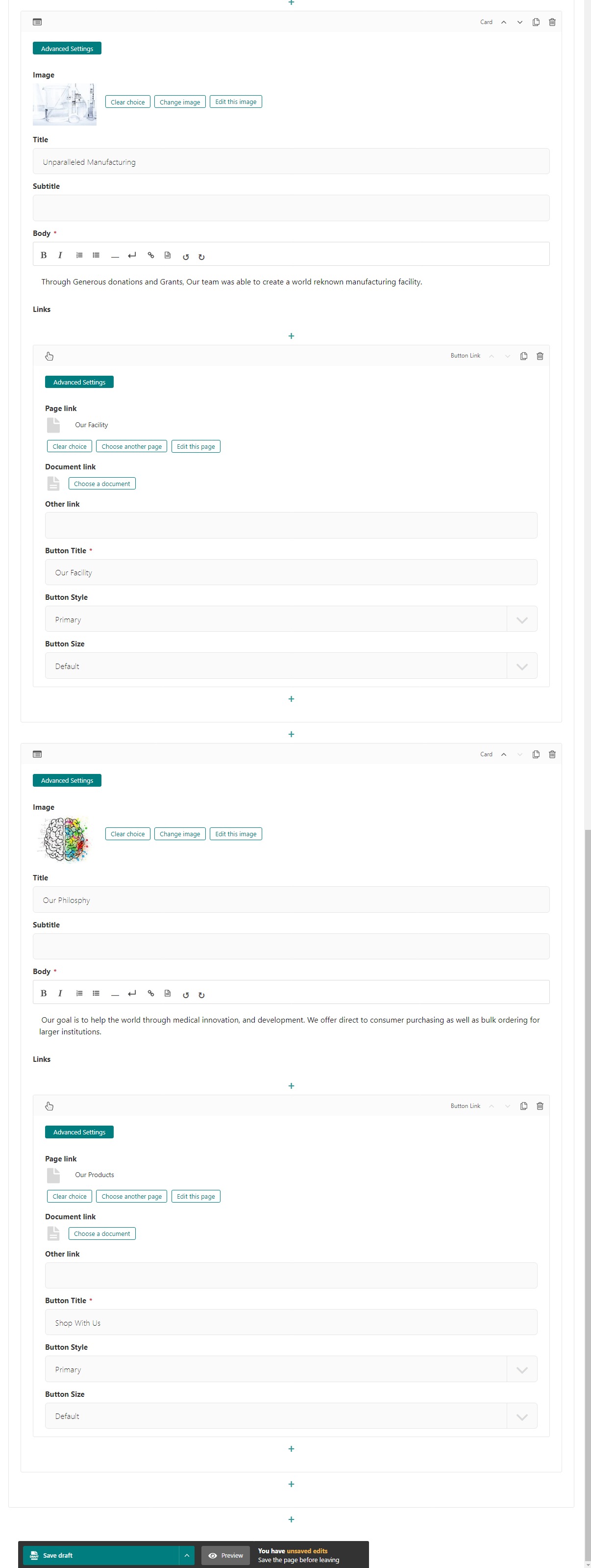
The home page editor after adding a card grid with three cards 2 of 2.
Save draft and click the Preview button at the bottom, which will open up a preview of the home page in a new tab. Lookin’ good!

The home page preview after adding the card grid.
Note
At this point you may notice that the cards aren’t the same height.
To make all the cards equal height, We added bootstrap class h-100 to each card as seen here:
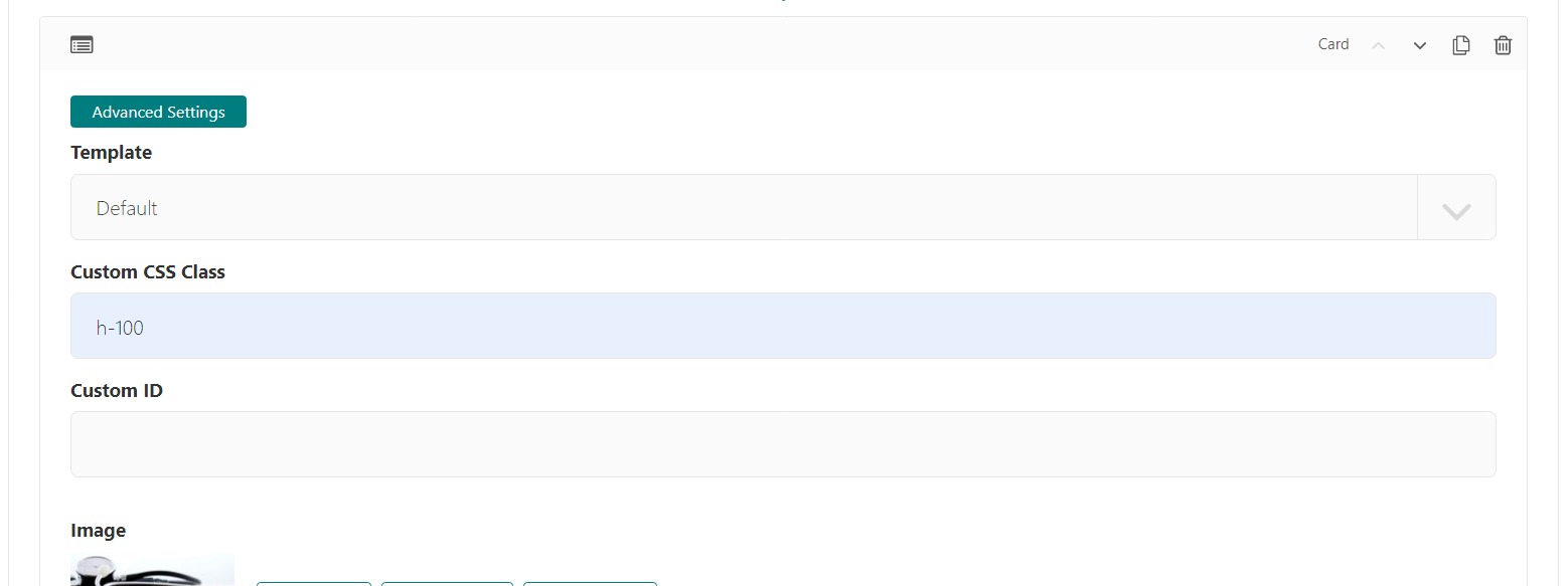
Card block with custom class of h-100. Be sure to do this to each card.

The home page preview with the same size cards.
Note
Check out these resource for cards: Card Grid Block and Card Block.
Adding more content to the home page
We’ll continue following this pattern to add content. While the Hero Unit and Card Grid provide “special” content formats, the Responsive Grid Row is the most general purpose block for adding content. There is also an HTML block for inserting raw HTML if needed.
Let’s look at Responsive Grid Row in practice.
Add a Responsive Grid Row below our Card Grid
Select Column
Change Column size to “Half - 1/2 column”
Select Text
Enter “Our Products” and make it an H2.
Enter a few sentences of text under the “Our Products” in the same text editor.
Add a Button link linked to the “Direct to Consumer”. (child of Our Products). Be sure to give a Title.
Add a Button link linked to the “Bulk Sales”. (child of Our Products). Be sure to give a Title.
Below the Column Block (second to last “+”) Add another Column
Change Column size to “Half - 1/2 column”
Add an Image We used this one
Our Products editing Page.
Save and Preview

Home Page with Our Products added.
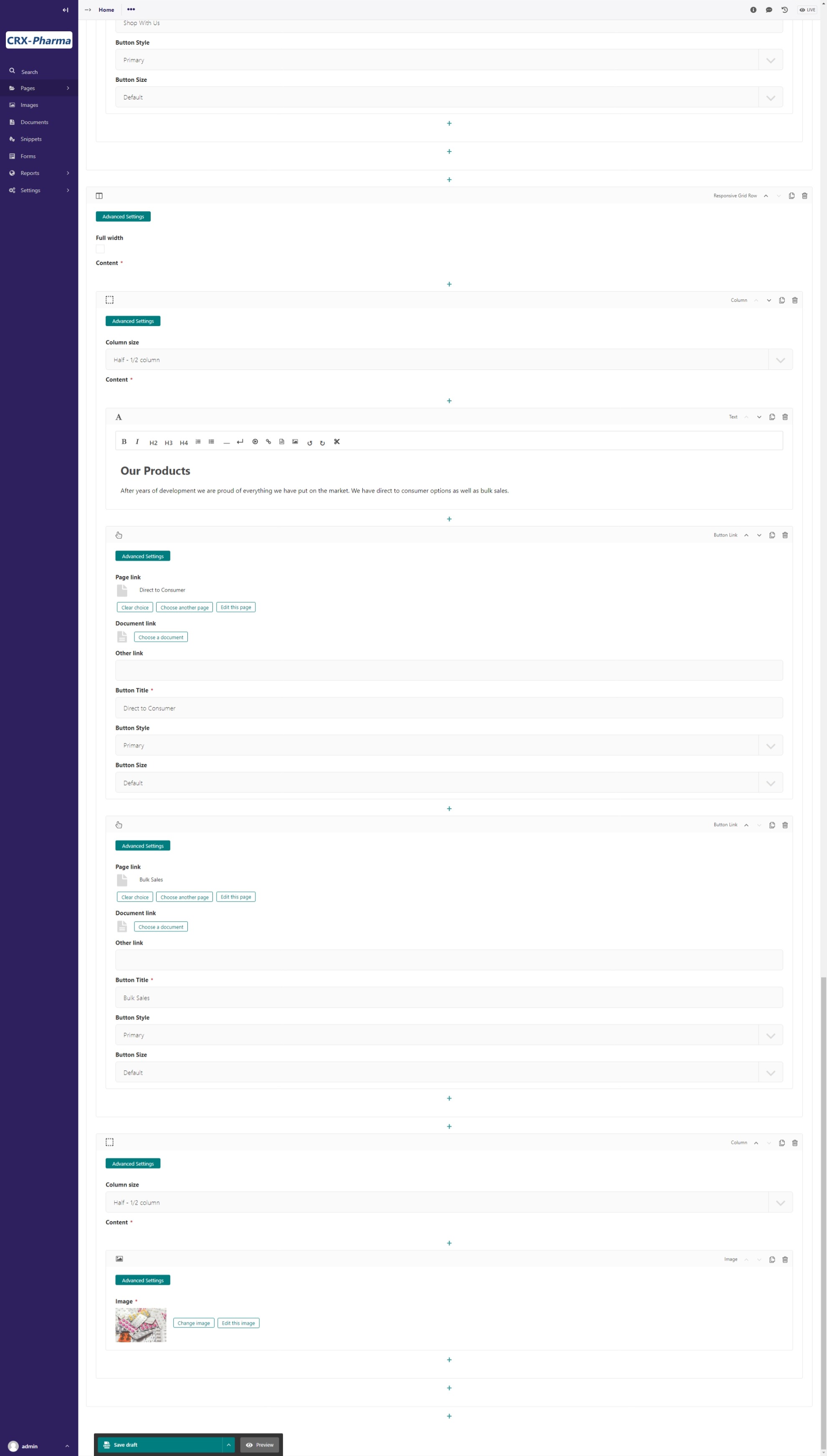
We are going to do another Responsive Grid Row
Add another Responsive Grid Row
Add a Column set it to 1/2 column with this image
Add a Column set it to 1/2 column add text for Our Facility
Add a Button Link under the text block that is linked to Our Facility.
Save and Preview

Home Page with Our Facility added
For the Last two Responsive Grid Rows reference the last image on this page as a guide. Follow these links to get the images. (note: I cropped my images square using a photo editor):
To get the green background, white text, and proper padding you will want to add “bg-secondary text-white p-5” in the Custom CSS field on each column with text. These are bootstrap classes that come pre-loaded in Wagtail-CRX. When we set the secondary color to green in part 01 of the tutorial, we made all the bootstrap classes that have “secondary” in the class name reference that color. This screenshot shows how to add these classes to the column. You must open advanced settings on the column:
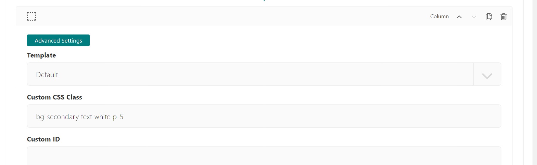
Bootstrap classes on columns
Hopefully you were able to follow along and your page looks like this:

home page after tutorial part 3 (note: the images of the doctors were cropped to be square)
Next we will look at building a Navbar and Footer.