 Wagtail + CodeRed Extensions
Card Grid Block
Creates a card grid layout with content and button options. Card Grid puts cards in a row by default, however you can use bootstrap classes to achieve specific layouts. Take a look at our example. See bootstrap docs for more information.
Field Reference
Fields and purposes:
Full Width - If selected, sets whether the card grid spans the entire width of the screen
Content - The individual cards in the grid. See Card Block for more on cards.
Example
In your page editor (we used the “career” page we setup in the getting start tutorial):
Choose Card Grid
Select the Card
Enter some info about in the card
Make at least 4 cards total.

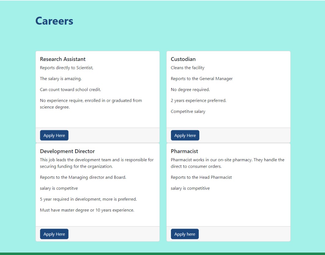
4 cards in a row with different heights.
We can see here that the cards, show up in a row, and the height fits the content. If we look at the docs, we’ll see you can add “h-100” to each card and they will be the same height. Let’s try it.
In the page editor, go to each card and open the advanced settings. Add “h-100” to the Custom CSS Class.
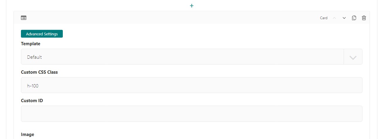
Card block with h-100 added to Custom CSS Class
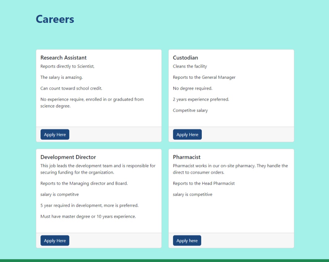
Save and preview

Card grid with bootstrap class h-100 added to every card.
Cool. Let’s make this a 2 by 2 grid. Looking at the docs we see, the card grid uses specific classes to determine how many cards should be in each row, based on a screen size. For our example, we’ll add row-cols-1 row-cols-md-2. So the smallest screen size will have 1 card per row and medium (tablet size) and up will have 2 per row. Let’s take a look.
In the page editor, open the advanced settings on the card grid. Add row-cols-1 row-cols-md-2 to the Custom CSS Class field. Save and preview.
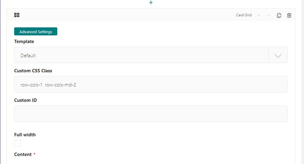
The page editor screen with Custom CSS Class on the Card Grid Block
Preview of Custom CSS Class on the Card Grid Block
The last thing we will look at is gutters. The bootstrap card grid has built in classes that make spaces uniform between the card. These are known as gutters. Let’s add class g-4 on our card grid and see what that looks like. Our custom class now looks like this row-cols-1 row-cols-md-2 g-4. Save and Preview.
Preview of Custom CSS Class on the Card Grid Block with gutters