Button Block
The button block renders an HTML anchor styled as a button. This can be used to link to pages, documents, or external links.
Example:

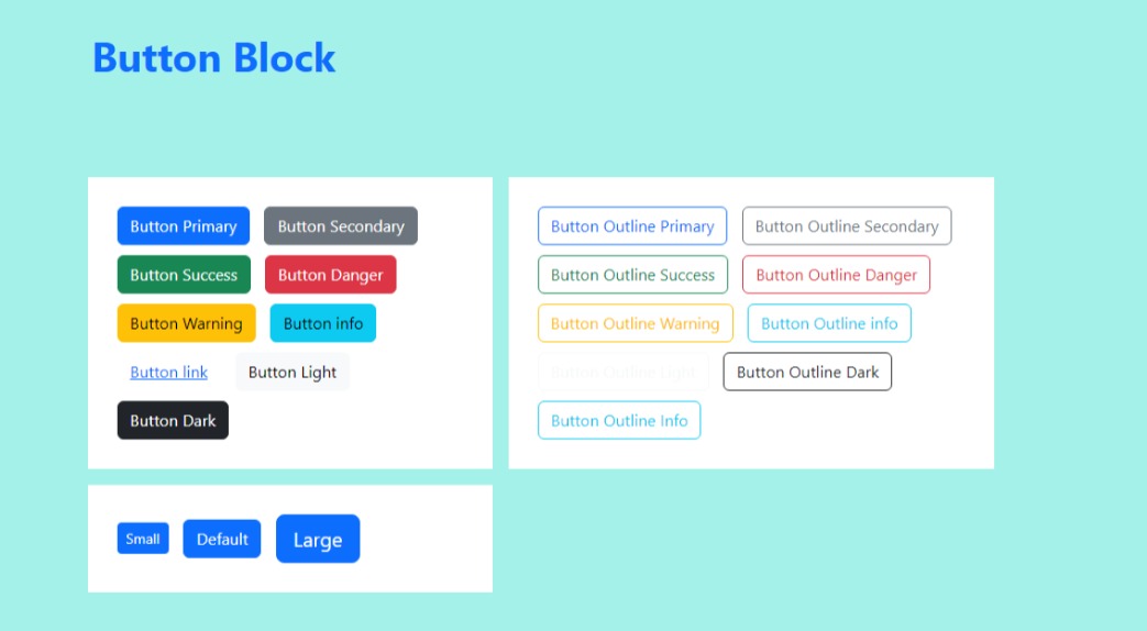
default button styles
Note this screen shot was taken using the default bootstrap colors. If you use a theme or change global colors with sass, they will likely be different colors.
Field Reference
Fields and purposes:
Page link - Reference a page within the CMS.
Document link If a Page is not selected, reference a Document within the CMS
Other link - If a Page or Document is not selected, the value of this field will be used as-is. If a Page is selected, then the value of this field will be appended to the Page URL. This is useful for linking to fragments or element IDs. For example: Page
/about/with Other link#teamwould then link to/about/#team.
Button Title - The text to show on the button. You can insert simple HTML here as well, such as
Learn <b>More</b>.Button Style - The appearance of the button. This is a choice loaded from
CRX_FRONTEND_BTN_STYLE_CHOICESDjango setting and is inserted as a CSS class in the HTML.Button Size - The size of button. This is a choice loaded from
CRX_FRONTEND_BTN_SIZE_CHOICESDjango setting and is inserted as a CSS class in the HTML.